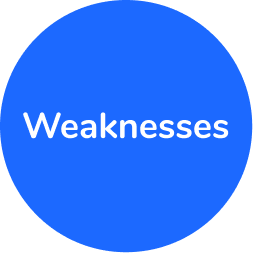
Houz App

An app for smart home device owners

Read more

Project overview

With homes becoming more and more connected, and with communication means always developing, I identified a gap in the market for a global solution that enables smart home device owners and tech savvy people to access expertise from the comfort of their own sofa.
During my UX program at CareerFoundry and as part of my UX learning process, I decided to tackle this problem by following the brief below.

Brief

Enable anyone, anywhere to instantly chat with an expert in virtually any field.

My role

UX/UI Designer

Project duration

5 months

Tools used

Figma prototype

Here, you can freely access the prototype on Figma:

Design Thinking process

This project was tackled following the Design Thinking process. Although these are phases, you will see that these are not linear and, because of different phases of testing and feedback, the product has continuously evolved, from the features to respond to a persona's needs, to the reiteration of the user interface. These continuous phases of reiteration are part of the life cycle of any live product that aims at optimising the user's experience.

Table of content

BACK TO TOP

Research

I started kicking off my project by focusing on market research and user research. The idea here was to identify if a platform was offering the same type of products, but also the business and UX profile of other expert applications

Problem statement

Smart device owners and tech savvy people need a way to easily access information on fixing issues quickly by themselves or finding a device tailored to their personal needs because their personal comfort at home is at stake and the right information is hard to find.
We will know this to be true when we see users scheduling booking with experts .

Competitive Analysis

I will discuss two competitors that are Expert Apps and Websites:As I was unable to find apps that directly compete with my project idea, specifically for Smart House devices, I chose to conduct an analogous competitor analysis.

Expert Republic

Their key objective is to create a platform where users can book a video call with an expert on a given topic, targeting young professionals in their 30s.
What sets them apart is their sense of community and design. This app has visibility advantages when it comes to its SEO ranking and a good and modern UX interface, which I covered in detail below, together with the possibility to browse through prior to creating an account.

What particularly interested me in their business model was the free chat option, giving the user a chance to make the right choice before booking a paid call.

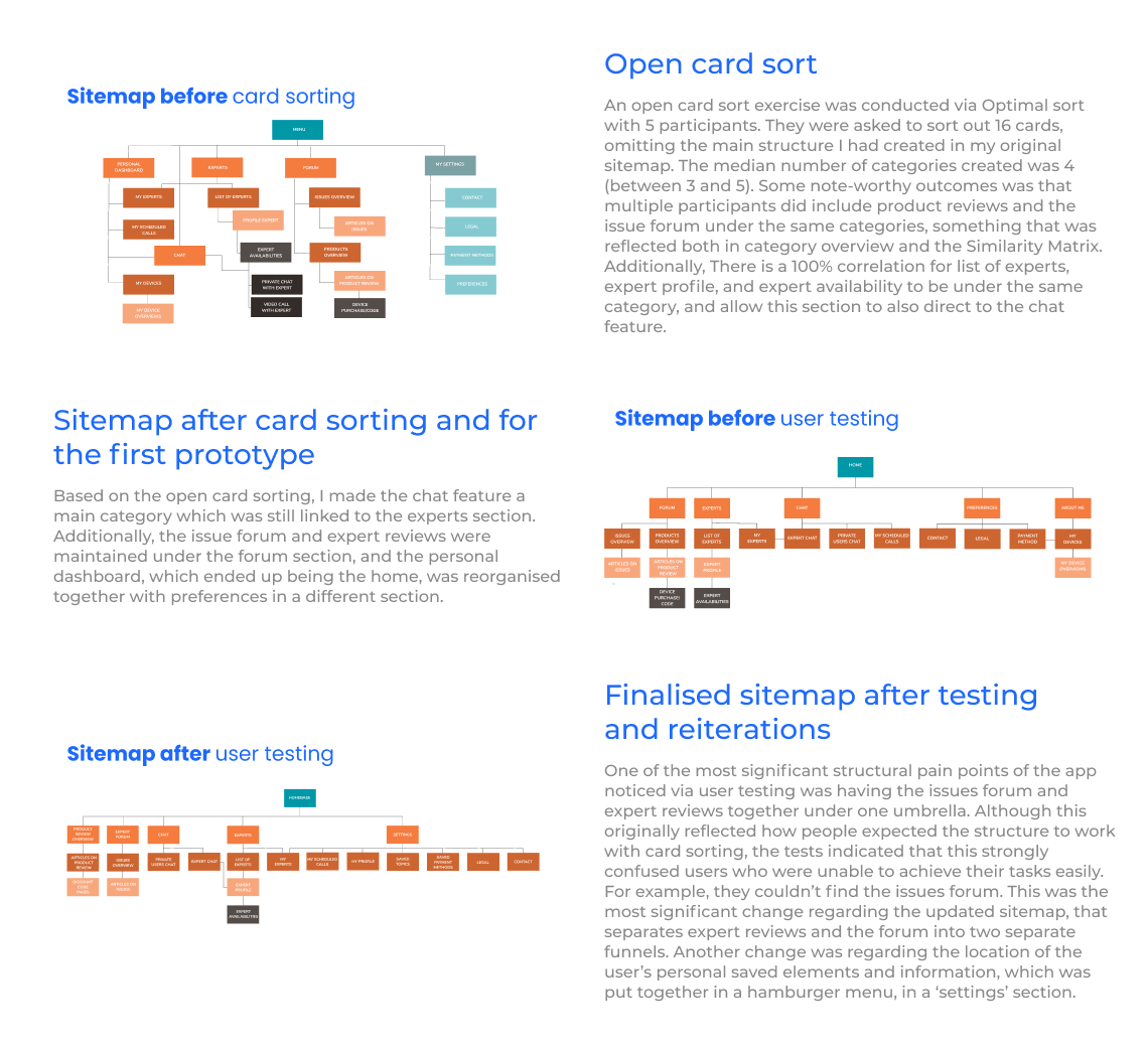
In this UX competitive analysis, I went through their main features to see any patterns and good structures they implemented, together with any pain points I could identify.

Fantasticservices

This service consists in live online video call sessions with certified plumbing experts in the area of London in the United Kingdom. It allows users to book appointments with an expert who will walk the customer through their issue, and visit them on location if needed. Their business model is geographically limited, but also represents a strength on the market (global solution).
Their overall expertise and service in a niche is clearly their market advantage when it comes to plumbing in their region, and their user interface and communication seemed to mainly target young families and female professionals between 20 and 40. However, their lack of transparency regarding a pricing system seemed like a potential pain point.

User Interviews

In order to better understand users and their behaviour or feeling towards smart devices, the first step to defining user personas, I conducted in-person interviews with three participants, and collected and analysed the results through affinity mapping. Which led me to making the new main conclusions based on commonalities and recurring elements:

User Personas

Based on the user and market research, I created 3 user personas that represent hypothetical groups of users , the main persona being Eliott. This helps identify key user needs and goals, together with behaviours, and to make sure that we keep emphasizing with these user personas throughout the design process.

Functional Requirements

By Identifying who I am designing with, and based on the project brief, my functional requirements were better defined. After receiving additional feedback, I distanced myself later on furthermore from video call communication with experts, a change I have adapted in my functional requirements.

User Journeys

Once those user personas have been identified, I developed 3 use journeys, based on the needs and goals of two of the user personas, which will then help me develop the necessary user flows that help them fulfill these goals. 
The user journeys focus on achieving the following tasks, and have helped better identify the main structure and features of the app: 

User flows

Focusing on the happy paths, I designed user flows to visualise the necessary screens needed for users to achieve their goals based on their user journeys. This is an efficient step in the process of identifying the main screens necessary when going forward with information architecture and wireframing. After testing and reiterating, I was able to make some changes to the user flows, which can be visible in the evolving sitemaps. This included deleting the ‘add device’ screen in the ‘find expert’ path, which aimed at targeting the search. Instead of manually adding devices in the homepage, filters can be set directly in expert overview.

Adding a topic to the forum

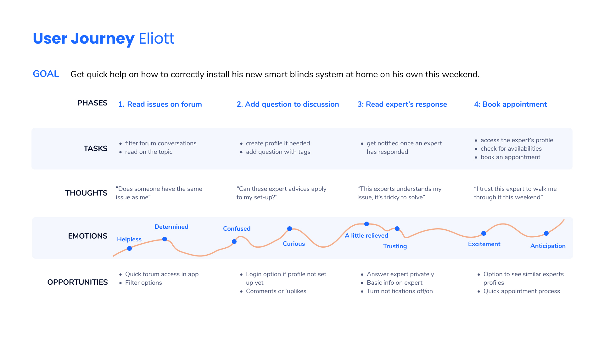
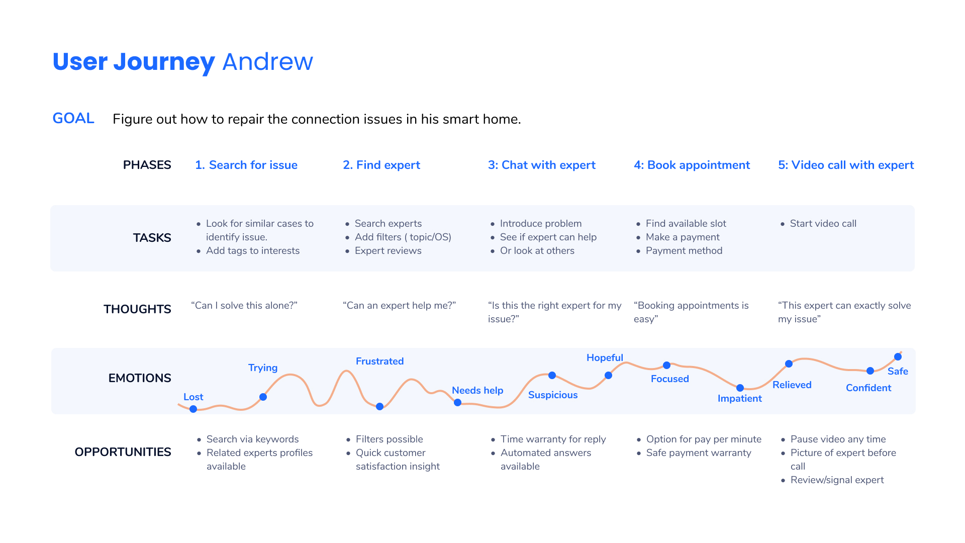
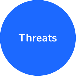
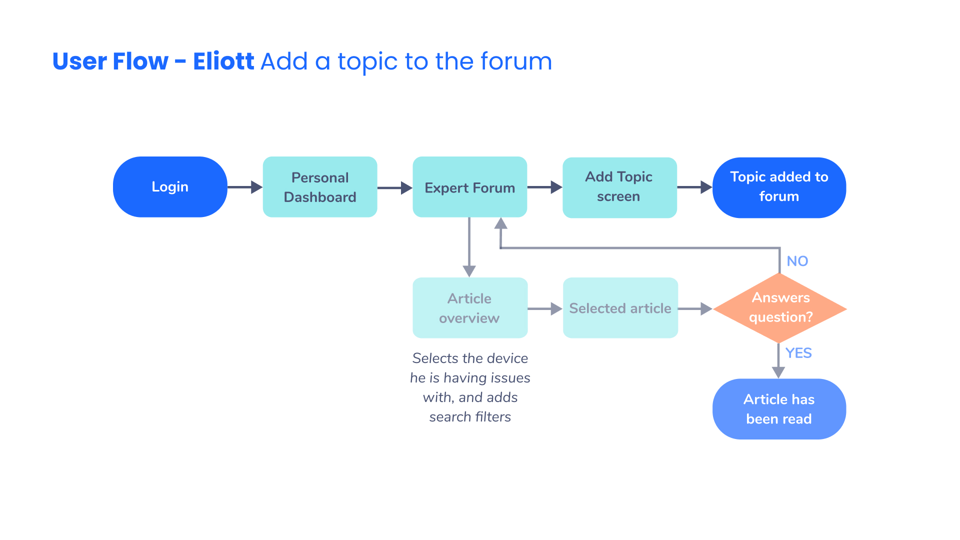
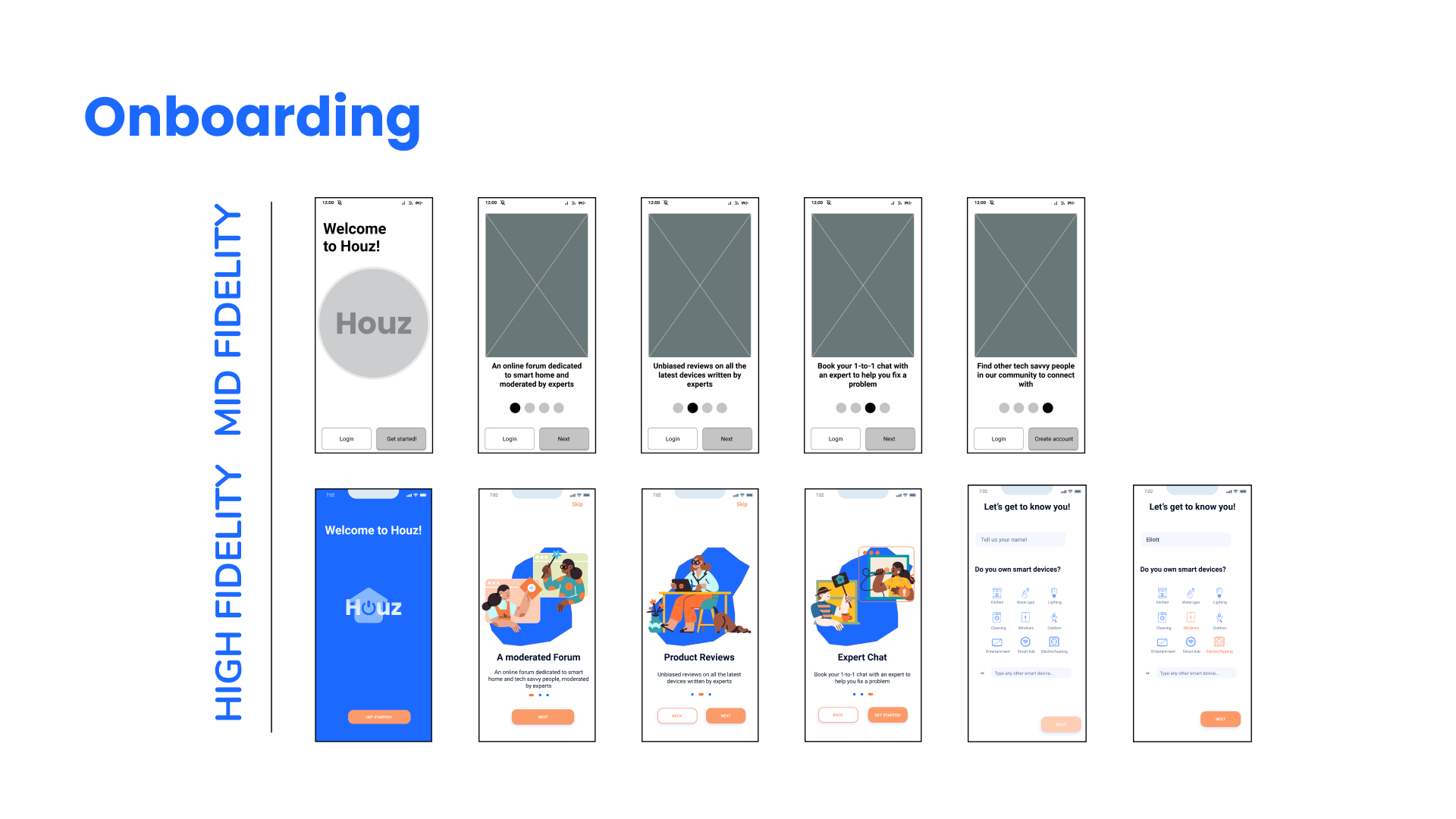
In this user task, the happy path is based on the idea that the user, Eliott, already knows that there are no pre-existing topics posted related to his issue in the expert forum. Alternatively, I included the other outcome if that were the case. 

Booking an appointment

In this happy path, the main aspect here was to find where Eliott’s decision making process would take place, and give him the possibility to make the best decision when it comes to picking the right expert. He can therefore go through an overview, and still confirm with the expert via chat that they are a good fit. As Eliott has a busy schedule, the expert availability screen give him a good overview of when the call can take place, and if it fits his own schedule.

Finding the right device

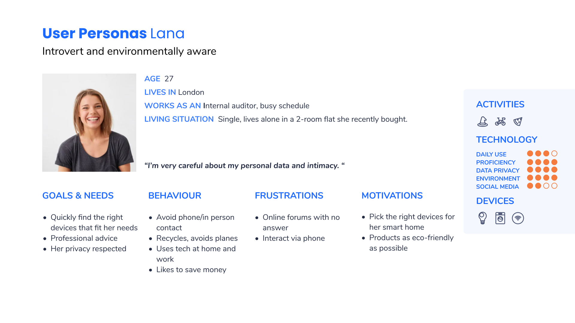
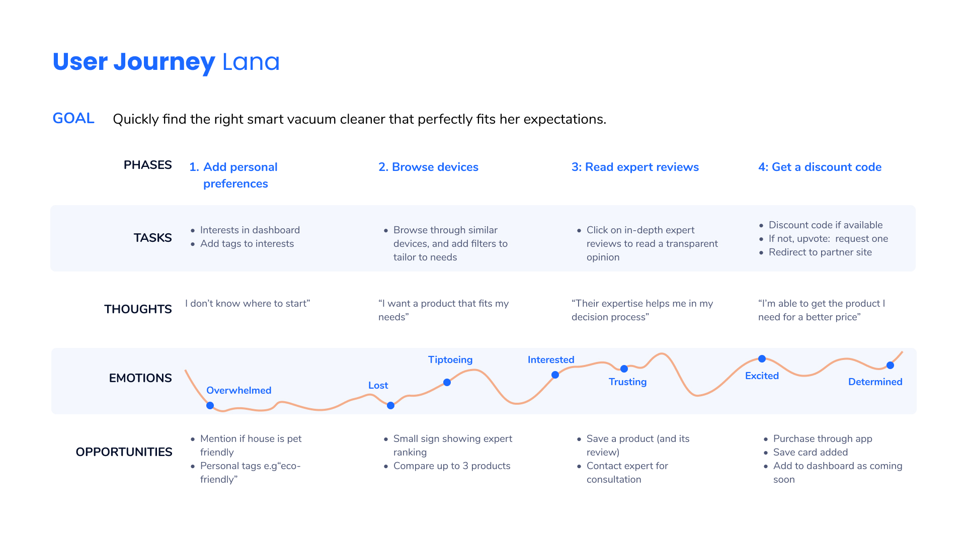
The third user flow is about comparing and finding a product via expert reviews.  Lana can skim through products, filter according to her needs, and find what fits her needs. The decision making process is supported by technical expertise, and the reviews shouldn’t be biased. The business model here is to offer discount codes for users on certain products if partnerships have been made. Otherwise, Lana could also upvote to request a code if there was no discount available currently on the discount screen. 

Information Architecture

A first sitemap based on user personas’ needs and user flows was first put in place to organise the structure of the Houz app, before being tested using the card sorting method, and reiterated after user testing. The first version made before card sorting was mainly done to understand which sections of the app and which screens are needed, so that a compartmentalisation car be better implemented. 

Wireframing

After first drafting pen and paper low-fidelity wireframes, and a few using Balsamiq, I designed mid-fidelity wireframes, which later on became high-fidelity wireframes. Some have significantly evolved, from a structural and UI perspective, after being tested multiple times with different participants and using different methods I discuss later on in the testing section. The mid fidelity wireframes enable rapid iterations and quick feedback loops.
‍Here, we can see the changes made to the homepage and tab bar:
  • Tab bar: settings are found in a hamburger menu, and the forum and device reviews are separated into 2 categories on the tab bar
  • Homepage: a scrollable page allows the user to skim through the main categories . Their personal settings like schedule and profile can be found in the hamburger menu. This was done to ease the confusion felt by participants both in user testing and peer review.
When it comes to onboarding, I was able, thanks to user testing, to see that the onboarding needed to be as concise as possible to keep their attention. Another pain point for them was the lack of interaction they had before getting into the homebase. 

Over time, this led to decreasing the number of onboarding slides, and adding a step where the user gives some info about their smart home devices so that it’s already in the app. Pop-up info boxes with a darker background worked better in preference testing as users got to read the text easily, hence the changes in high-level prototypes.

User Testing

When it comes to user testing for Houz, I have conducted in the first round moderated remote tests with 6 participants. After reiterations on the design, I then conducted Preference testing on 4 features with 13 participants. In my last round of testing, I was able to collect feedback from 5 fellow UX and UI designers in the form of Peer review. These different tests, each followed by relevant iterations based on collected feedback, allowed me to improve the Houz app from a design and user centric point of view, both from potential users and professionals in the field.

Usability Testing

For the usability test, I wanted to see how easily the users can understand this new app and how they can navigate through it in order to achieve their tasks.
The aim is therefore to see how learnable the app is and how easily it is integrated by those participants. To do so, I conducted moderated remote tests with 6 participants (18-50 y.o, smart device owners or enthusiasts, English speaking).
The test included 2 open-ended questions to obtain descriptive feedback on the onboarding and dashboard, followed by 3 scenario tasks to complete in order to notice any pain points or errors in the UX and UI design of the app. 

You can find the full usability test script here.

Results and prioritisation

I based my result analysis on Jakob Nielsen’s scale, and focused on errors as my main metric. After clustering the findings through affinity mapping, I was then able to measure those. The Jakob Nielsen scale allowed me to prioritise my actions and start by focusing on any arising issue that significantly hindered the participants' experience, together with the recurrence of these issues. 

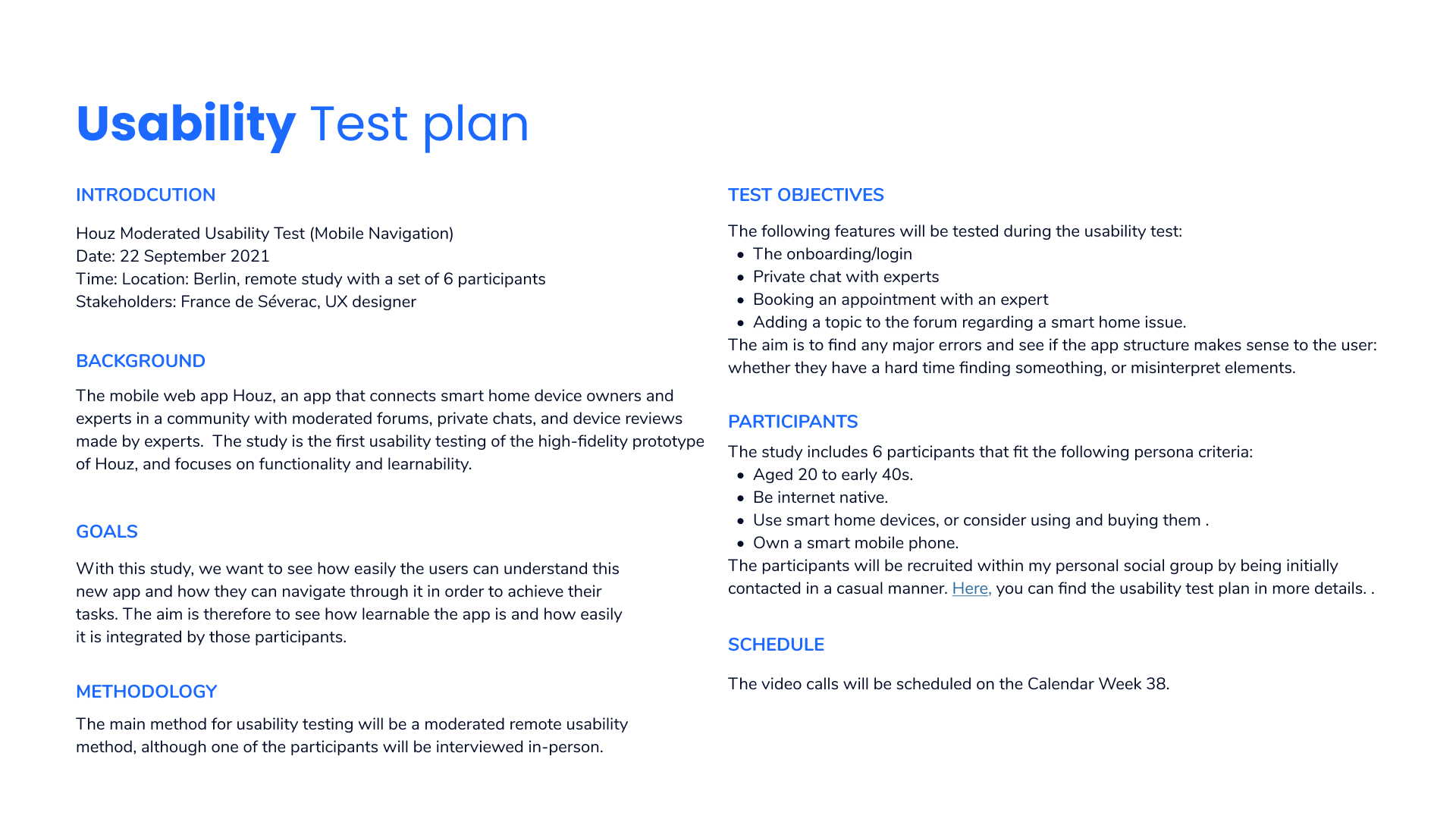
You can access the raindow spreadsheet here.

Usability test reports and iterations

For this study, and in the first analysis of the results obtained through the 6 participants interviews, what I noted included: 

Click here to access the full usability test report.

Preference Testing

I then conducted, with reiterated wireframes, preference testings. These consisted of two design alternatives for the same screens, and the purpose of these tests was to improve the app’s user interface design. I used UsabilityHun to conduct 4 preference tests with 13 participants, and obtained 3 conclusive results related to background colour for onboarding, font size, gradient card background as shown below, and the use of grey filters behind pop-up info boxes. 

Peer Review

To further gather different points of views, I then gathered peer feedback from 5 fellow UX and UI designers on my iterated design. This was a great way to understand more how a user may perceive the product, but also gain from their expertise and design know-how. Some colour, font and design inconsistencies were noticed, together with other areas of improvements, such as the question of how useful or confusing a blurred filter may be (see below), or how lack of negative space between some of the clickable elements may make it difficult for certain users to achieve tasks. 

High-fidelity prototypes

Here are a few screens found in the high-fidelity prototype you can access at the bottom of the page.

Design System

Once the design is ready for implementation, the release of a design system can finally be made ready, which will be an effective way to align with developers and other stakeholders, but also simplify and clarify communication. The developer hand-off requires rigorous documentation. For that, I designed a style guide along with an element database with recurring elements in different resolutions. Using Figma, the CSS is directly located in the document for developers, but other tools like Zeplin can help developers find the related code.

Houz Style guide

The Houz style guide gives an overview for any stakeholder who may need to work now or in the future on the Houz App, so that the interface stays consistent throughout the life cycle of the app, and that my design as the UX/UI designer is successfully implemented.. A new style guide should be set up in the future if the app’s interface is redesigned.   
Click on image to see the style guide, or below to access the PDF version in another tab.

STYLE GUIDE IN PFD VERSION

Learnings and Next Steps

The Houz App project has taught me the importance of keeping the user’s interest as the focal point of any design decision. I have also learnt that being able to go through multiple rounds of testing is necessary to make conclusive design conclusions. This project was also very beneficial in learning to apply a rigorous and aligned form of documentation, so that the access to any element or piece of information can be easily provided to any stakeholder, which is of high priority when collaborating with a design team or other departments. 

The next step for Houz App and its further development lies in the following aspects: 
On a more personal level, this project and course at CareerFoundry has taught me how much I appreciate the struggle of spending hours finding the right solution that works, working over and over again to get something right! It makes me want to go further, and strive to be a better designer every day.

Thanks for your time!
Drop me a line regarding this project or any other you may have in mind!
France.