Speakeasy App

Learn a new language on the go

Read more

Project overview

For this case study, I have been looking at the existing Language Flashcard Apps on the market, and developed a product that meets user’s needs and goals, while fixing the current pain points that they are currently facing, and stops them from using such a tool to learn foreign languages.

My role

UX Designer

Project duration

3 weeks

Tools used

Figma prototype

Here, you can freely access the Speakeasy prototype on Figma:

Design Thinking process

This project was tackled following the Design Thinking process. Although these are phases, you will see that these are not linear and, because of different phases of testing and feedback, the product has continuously evolved, from the features to respond to a persona's needs, to the reiteration of the user interface. These continuous phases of reiteration are part of the life cycle of any live product that aims at optimising the user's experience.

Design Thinking process

For this case study, I followed a simplified version of the design thinking process. I started by the stage of empathizing to conduct some competitor and user research. and then defined a user persona and user journey in order to identify user needs and goals, from which I drew the first conclusions for the app. This enabled me to come up with the first prototype, first via paper and then in a higher fidelity level, which I tested through usability testing.
Once The testing process finished and the results analysed, I was able to reiterate the design. This simple single reiteration loop should be further improved via further testing in a longer project.

Table of content

BACK TO TOP

Research

In order to better understand the user needs and current behaviours around language apps, I started by exploring the current user interface of language flashcard apps available, and conducting moderated interviews.

Problem statement

Language learning individuals need a language app that includes flashcard reviews and exercises with tailored thematics, durations and a reward system in order to regularly learn enough of their target language to have basic conversations and be independent when communicating, travelling or settling abroad.
We will know this to be true when we see that users have kept on learning regularly over a month, and that they have managed to successfully complete exercises based on their saved topics.

Competitor Analysis

I chose to analyse the following apps on an Android device:  Lexilize Flashcards, Quizlet, and Words.
I wanted to find apps with flashcards, and some exercises to practice. I have set German as my target language in all three.
After conducting a UX competitor analysis for all three apps, my main findings were the following:

User Research

In order to better understand potential language app users, I conducted a in-person and remote interview with 5 participants.
All were selected for having used language apps in the past, or for currently using them. The age range was from 25 to 35 years old.
The interview questions were the following:
After following an interview script with all candidates and completing a 25 to 30 minutes interview, I collected the data and categorised findings in “I” statements, and then clustered these findings into categories that stood out.
Here, you can see some of the main learnings that followed these 5 interviews.

Understanding our audience: User Persona

Based on the collected feedback, common pain points, behaviours and needs identified during the 5 user interviews, I created a user persona, Louise, which plays a guideline role throughout the ideation and prototyping phases. Indeed, referring to Louise's profile helps making sure that the product aligns with the user needs and behaviours.

User Stories

Job Stories

Hypothesis statement

We believe that by building an interactive app that provides shorter exercises around specific thematics with a reward system for users like, we will achieve them getting ready and confident enough in their target language to use it on a daily basis during their trip or in their new city, and to communicate on basic topics with family, friends, and acquaintances.

Functional Requirements

By Identifying who I am designing with, and based on the project brief, my functional requirements were better defined. After receiving additional feedback, I distanced myself later on furthermore from video call communication with experts, a change I have adapted in my functional requirements.

User Journey

Once those user personas have been identified, I developed 3 use journeys, based on the needs and goals of two of the user personas, which will then help me develop the necessary user flows that help them fulfill these goals. 
The user journeys focus on achieving the following tasks, and have helped better identify the main structure and features of the app: 

Defining the Problem: User flows

Based on the user persona and user journey developed above, I worked on two user flows, which represent the ideal path for Louise through the Speakeasy app to achieve a goal she has in mind. Here, the first user flow deals with adding a vocabulary word she wants to learn and tailors to her interests (useful vocabulary), and the second on reviewing flashcards to help her remember relevant vocabulary.

Add New Vocabulary

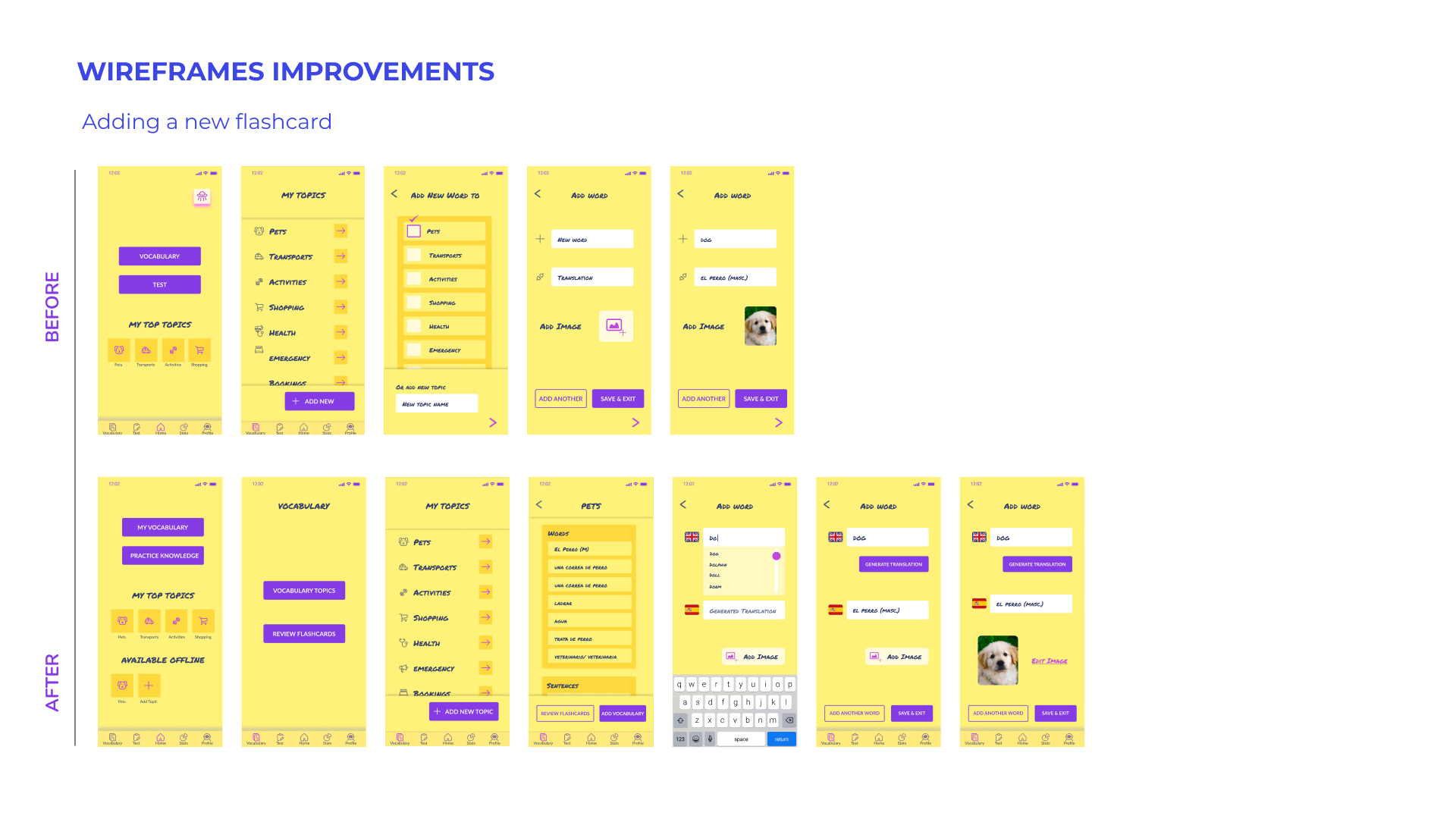
I’ve decided that because Louise wants to learn words depending on specific topics and life situation, she will have a user flow to add a new word or multiple at the same time within a specific topic.  If she wishes to upload a new vocabulary for a different topic, she will go back to the “add New word” button in the vocabulary library.
As images are also very important to remember new vocabulary, she has the option to add images directly from her phone’s library or camera.

Review Vocabulary

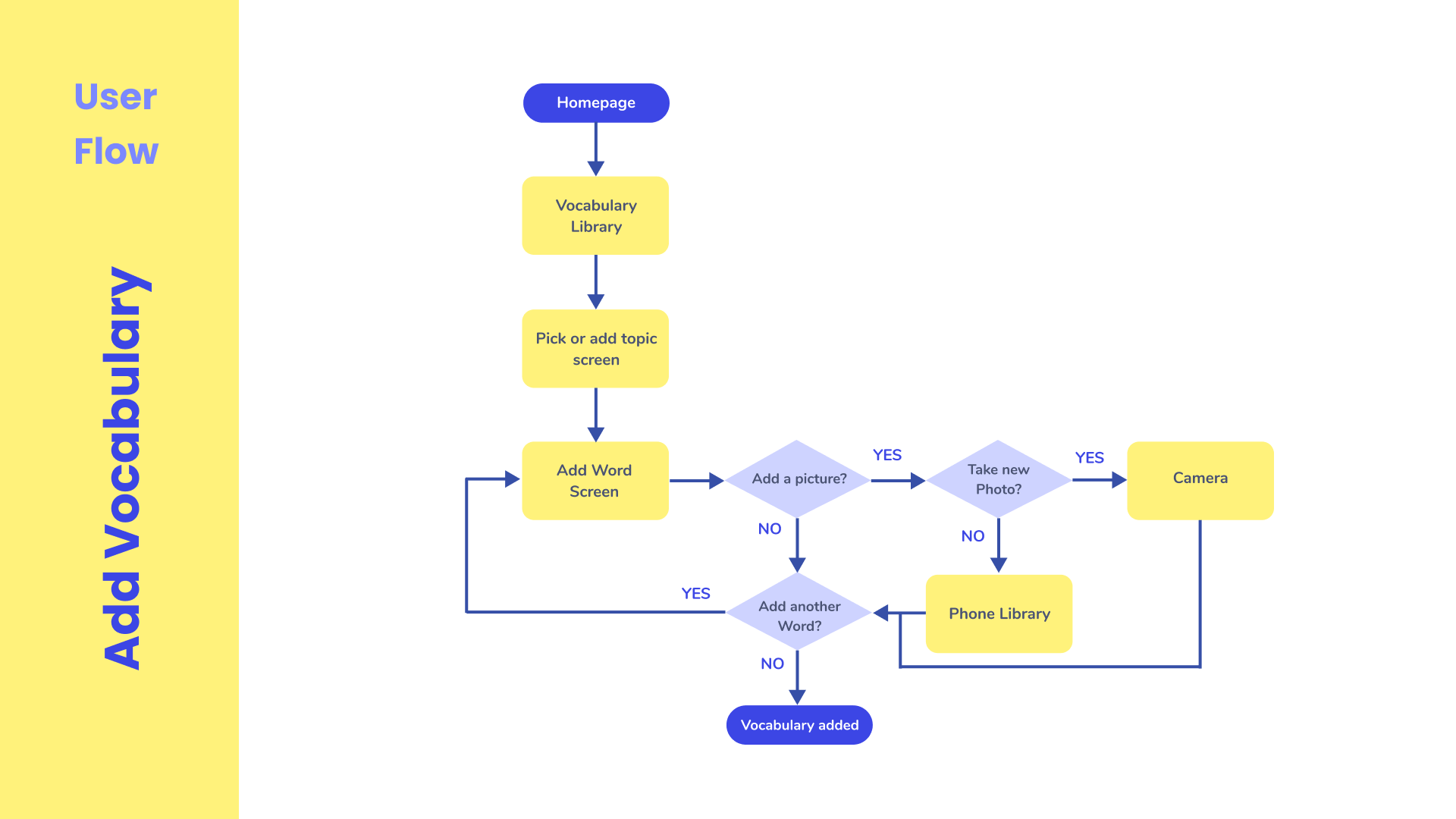
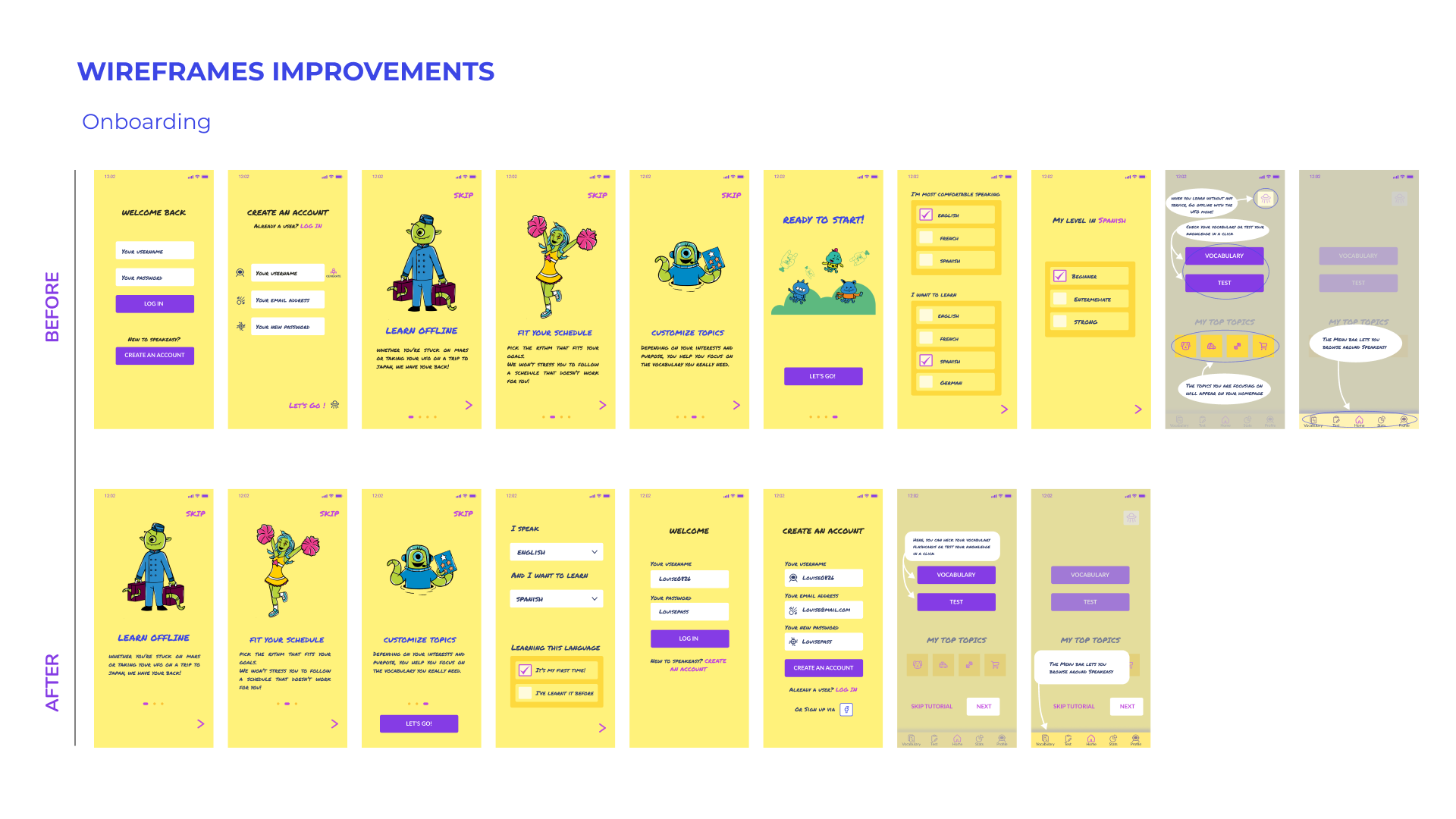
Here, the focus was on making the app as adjustable as possible to Louise’s busy schedule. I also focus on allowing her to pick which topics she wants to practice, together with the opportunity to already see that vocabulary in context as soon as possible.

Information Architecture

The information architecture of the app was first ideated based on user flows and Louise's needs as a user.
It was then adapted after prototype user testing. Here, in the updated version, the 'test knowledge' section is separate from vocabulary to help users better locate it as an independent feature, and reviewing or adding vocabulary flashcards are also separated early on in the structure to avoid confusion noticed throughout usability testing.

Wireframing

After using pen and paper, I created the first version of Speakeasy high-fidelity wireframes using Figma.

First version of wireframes before testing

User Testing

In order to iterate and improve the design and information architecture of the app, I conducted a usability testing round. This enabled me to collect information on participants experiences and behaviours, asses the data and identify the main points of improvements. In a larger project, I would conduct more than one form or round of testing. but as this is a case study, I have limited the testing to a single phase.

Tasks for users

To test the prototype, I conducted remote moderated usability tests with 5 participants. They were asked to go through the following tasks:

  • Sign up to the app and go through the onboarding
  • Save a new word and add an image
  • Find the user section and edit the username
  • Review flashcards using the offline mode

User Feedback and recurring pain points

Once the five usability tests completed, the information collected was classified using the method of I statements, by which I compartmentalised the participants' reactions and feedback according to their actions, thought processes and the feelings they expressed or showed via body language.
These information helped me to then identify patterns, which I then assessed in a user test report.

User Test Report: Feedback and recurring pain points

Based on user test report, the main feedback collected from usability testing highlighted the following major issues. These issues were first sorted out and prioritised based on their level of error severity. This was done using the Jakob Nielsen error severity rating system, and allows better time and resources allocations in a project to make the relevant changes.

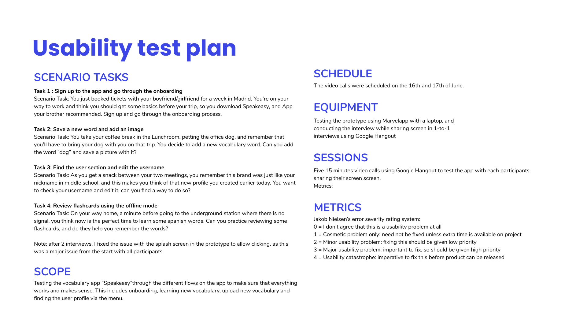
Here, you can access the PDF version of the test report.

Prototype Improvements

Based on the usability report, I made revisions to the following sections:

Onboarding

What I changed:
  • Create an account feature after the introduction
  • Made it more clear that only one language can be picked
  • Reduced the buttons in the login, and enabled to create an account via Facebook
  • Reduced the amount of onboarding slides  from 14 to 7 and created a “next button”, and clear directions for the path to take

Edit Personal Informations

What I changed:
  • Changed the profile page with the way things can be edited
  • Added a save button
  • Limited the number of buttons by deleting repetitive ones
  • Added a “pencil” image on username to indicate possibility for direct change

Add New Word

What I changed:
  • Changed the button to “add new word”
  • Fusioning “add to X topic” to the new word screen for less steps
  • Made the “add an image” more clear with only one button
  • Add an option to generate a translation automatically

Review Flashcards

What I changed:
  • Changed the button on homepage to vocabulary
  • Added the option to review vocabulary on the vocabulary section
  • Added a 20 minutes option for time, and removed the airplane mode option at that point of the funnel
  • Deleted the eye icon and added an option to leave the exercise at any point on the flashcards
  • Changed the location of the loudspeaker icon ( was not an important change but still relevant as that is an easy IT development task)
  • Give the option to only pick one topic to review at a time
Here are some of the improvements made on the wireframes based on the changes:

High Fidelity Prototype

Learnings and Next Steps

My main learnings of this case study have been the importance on focusing on user pain points to better understand their user behaviours, and the benefits of moderated testing when it comes to the learnings based solely upon participants body language and reaction time.
When it comes to this type of product and apps, letting the user onboard prior to creating a account helps building trust and brings significantly better user retention (over going for competitors).
Going through the design thinking process has also taught me to better focus on making sure user interview questions are as specific as possible, and to focus early on in testing on content structure. This is something that I worked on via card sorting in another project for the Houz App.
When it comes to the app’s development and prototype reviewing, the next steps would be to create and test a reward system method.
Moreover, creating a section where the user can store important sentences will be greatly rewarding both for user experience and user retention, as this will bring an additional benefit to the user when travelling abroad, for example.

Thanks for your time!
Drop me a line regarding this project or any other you may have in mind!
France.